Rabbitv1

SUMMARY
Rabbit is a place where you can watch anything online, together in sync, with anyone. It's mission is to bring people closer together through content and shared experiences.
My role at Rabbit was the sole Product Designer of the company. I worked closely with the product leads and managers to design all features on all platforms from end to end. Some major accomplishments included redesigning the Web and iOS (iPhone) client & designing a brand new iPad and Android app.
iOS REDESIGN
Main Navigation - One of my first big tasks at Rabbit was to redesign the iOS app. The app was broken into 2 parts - discovering content to watch & entering a room to start watching with a friend. Since most of the users on iOS came from the web app, the ui/ux was somewhat familiar to them. But as for new users coming to the iOS app, via word of mouth or discovering it on the AppStore, it's a little confusing as to what do. One of the main goals was to make sure new users experience the core feature of the app, watching something in sync with a friend. Through data, we knew that this increased retention. A solution for having new users experience watching something with someone their first time was to allow all users to make their room public, which led to watching with strangers. This solved the goal of getting first-time users experience the core feature of the product the very first day and solving the problem of having to message or schedule a time with your friend to start watching, because the chances of that happening at that moment are pretty slim. This all translated to a new home feed - instead of having a feed of suggested videos to start a room with, we presented a feed of public/live rooms to join. With the rest of the app navigation, we decided to expose all the key features in the bottom nav bar - friends list, messages, & notifications. The goal was to make it look and work familiar like other social and native iOS apps.
Goals
- Improve usability of the app - navigation, exposing key features
- Fix the "watching alone" problem
- Update UI to make it feel more modern and familiar as other popular social apps
- Create a solid foundation where newer features can be added with ease
Problems
- Users are confused as to what to do when they come to the home screen
- New users end up watching videos by themselves
- Key features such as adding friends, messages, & notifications are buried under one icon


AFTER


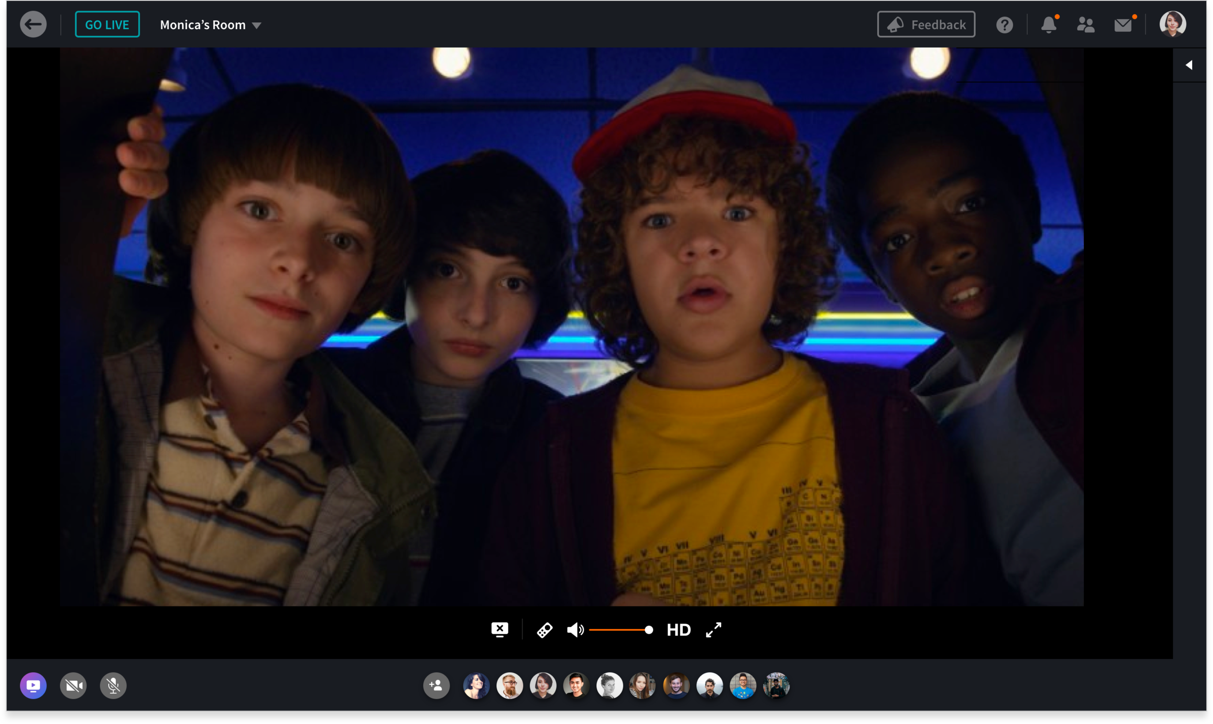
Room View - The core experience of the app had to be refactored. The previous design wasn't utilizing the space to it's full potential, key tool/actions were hidden behind menus, and it didn't feel like an immersive experience. How I approached this was by exploring ways to show/hide key features through gestures on the screen therefore eliminating the need for ambiguous menu buttons. Having gestures to show/hide features enabled the chat to be ephemeral without it having it to overlay on content persistently. I created an more immersive experience by having landscape video be truly full screen and having video chat take on a grid view instead of small circular avatars.
Goals
- Create an immersive and fluid viewing experience
- Update UI to make it feel more clean and modern
- Add gestures that are common in other video streaming apps
Problems
- Key features in Room View such as leaving a room, inviting friends, & room settings are buried under one icon
- Screencast / Video tools are only accessible in landscape
- Camera & Microphone toggles are hidden


AFTER


iOS REDESIGN - SIGN UP FLOW
With the redesign of the sign up flow, other than updating the UI/visuals, we wanted to add in an interest picker within the flow. This would allow us offer relevant content for the user to watch. One of the main issues I saw from user testing was that after a user finishes signing up, they would be presented with the home feed with random videos to watch with other people. New users ended up watching irrelevant content most of the time. They do get to experience what it's like to watch something in sync but they aren't able to have a connection with the video and contribute to the conversation. It's important for a new user to have an awesome first time experience so they can tell their friends about the app and continue the viral loop.
Goals
- Add interest picker to the flow to help the user find something relevant to watch after signing up
- Simplify and update the UI for the flow
Problems
- Facebook sign up is not on the first screen
- Unnecessary slide transitions on the first screen
- Too many text fields are presented at one time - makes it seem like work
BEFORE


AFTER


iPAD
Goals
- Take advantage of the larger real estate
- Show more and larger content
- Make landscape view an immersive video experience


ANDROID
Goals
- Use the iOS design as the foundation
- Should look and feel like a native Android app - apply Material design


WEB - HOMEPAGE REDESIGN
The number one goal for the web redesign was to increase conversion & retention. The previous version 1 design of the homepage was an explanation of what Rabbit is, with a call to action "Chat Now" button that would take you to the core app experience where you can browse videos to watch with others. Based on knowledge that most new users come to Rabbit already knowing what it is via word of mouth, it didn't seem necessary to have the whole homepage dedicated to explaining the product. I wanted to bridge that gap between the homepage & watching experience and decrease the chances of a user dropping on the homepage. With the launch of "Live Rooms", it was the perfect time redesign the homepage. Live rooms gave us a chance to entice users to experience the product through people and content.
Goals
- Increase conversion & retention
- New users should immediately understand what Rabbit is
- Make core features accessible on the homepage
- Users should be able to find content that is relevant to them
- Create a solid foundation where newer features can be added with ease
Problems
- New users are unsure of what Rabbit is when coming to the homepage
- New users end up watching videos by themselves
- Core features such as adding friends, messages, & notifications are only accessible in Room View
BEFORE
With the version 2 design of the homepage, I decided to add a smaller hero image with a tagline explaining what Rabbit is and laying out all live rooms in a 3 column grid - only showing 9 rooms at first with an option to load more at the bottom of the page. I ran user tests on this design to validate my two theories: 1) Did the user understand what Rabbit is within seconds of viewing the homepage? 2) Did it increase conversion? Both held up to be true. However, most users weren't pleased with the content that was being shown. That is because a lot of rooms are playing random YouTube videos. The homepage ended up looking visually noisy. How I addressed this issue was by limiting the amount live rooms being shown - max 4 rooms with an option to see all on a new page. And also, making sure we change the sorting algorithm to only show quality content. i.e Netflix, HBO, Hulu, etc.
VERSION 2
VERSION 3
WEB - ROOM VIEW REDESIGN
The room is the main feature of the product. It's where you watch videos in sync with other people. When a user first enters the room, they are presented with the Launchpad. It's where you go to find videos to watch, join other rooms, & rsvp for upcoming watching events. Before I started thinking about the redesign, I wanted to understand the user's journey and experience with the current state. I watched a ton of user test videos and learned a lot about the pain points and struggles new users ran into when interacting with the product.
Problems
- At first glance, most users are overwhelmed with the amount of content and controls that are presented
- Navigation is confusing - clicking on certain videos in the launchpad will either play in your room or take you to another person's room
- Main toolbar placement is unfamiliar - users get disoriented when transition from homepage to room


Depending on which video a user chooses - one will start playing in the their room and they will need to invite others to join them. The other will take them to someone else's room and you will be watching with strangers. Both of the video thumbnails look very similar and cause a lot of confusion.

As for the future design explorations of the room view, I wanted to address a few issues...
- Fix navigation issues by removing live rooms from launchpad
- Move the placement of the screencast controls underneath the video so there is some relation between the two
- Move the placement of the toolbar to the top of the page so it's familiar to other website / web apps
FUTURE EXPLORATIONS